Introduction
MAPG had already been operating in the market for several years, but there was one recurring challenge: people often struggled to read and remember the company name correctly. The visual connection between the letters “P” and “G” created confusion, leading many customers to pronounce the brand incorrectly.
The goal of this project was not to reinvent the brand, but to reorganise and strengthen its visual identity while preserving the essence that was already familiar to the client and its customers.

The Starting Point
The client first contacted me through my website after finding my work on Google. During our initial conversations, he shared the logo he had previously developed with a friend and explained the meaning behind the symbol integrated into the letter "P". The concept was inspired by a real electrical component used daily by the company in medium-voltage installations. Although the visual identity was still in its early stages, it was clear that there was a strong idea behind the brand and a genuine intention to create something distinctive.
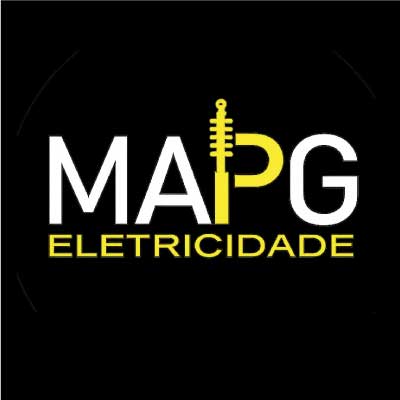
Original Logo

Electrical Component
Identifying the Real Challenge
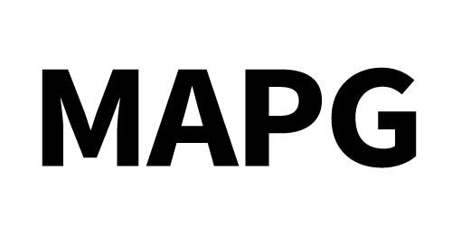
Although the company had already established a presence in the market, one issue continued to surface: the readability of the name "MAPG". The close relationship between the letters "P" and "G" created visual confusion, making the brand difficult to recognise and remember. That was where the creative process truly began. The problem was never the name itself — it was the way people read it.
Creating a Clearer Reading
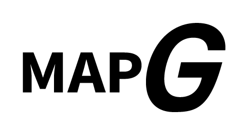
My first decision was to use a bold sans-serif typeface. It felt like the right direction for a company working in the electrical industry, where strength, precision and reliability are essential qualities. To improve readability, I enlarged the "G" and introduced a subtle forward tilt, giving it greater presence and a sense of movement. At that point, the identity started to come together. The "G" had become the defining visual element of the logo, giving the brand a stronger and more memorable character. Interestingly, the shape also reminded me of an electrical connection point, reinforcing the technical nature of the business while creating a distinctive graphic feature that made the logo easier to recognise.
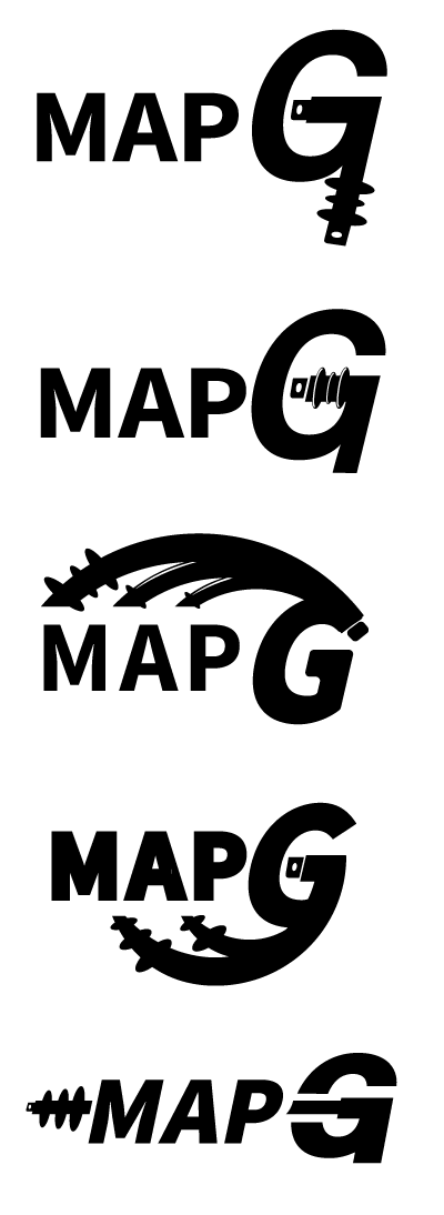
Integrating the Electrical Component
The next challenge was finding a way to incorporate the electrical component the client had shown me without compromising the simplicity of the logo. My first instinct was to integrate it into the letter "G". I immediately liked the sense of movement it created and the way it naturally wrapped around the "MAP", almost like a continuous flow.
That connection helped unify the entire logo, creating a stronger visual relationship between its different elements while reinforcing a sense of continuity and stability.
One concept quickly stood out from the rest. By allowing the "MAP" to follow the angle of the "G", the logo developed its own distinctive visual language—more dynamic, balanced and cohesive.
The electrical component became more than a technical reference; it evolved into the graphic element that connected every part of the identity into a single, recognisable mark.
Movement, Speed and Energy
At this stage, the identity was beginning to communicate exactly what I had envisioned: movement, speed and energy. The overall composition felt balanced, consistent and visually confident, creating a distinctive identity that naturally reflected the company's work in the electrical industry. Rather than relying on decorative elements, the logo expressed these qualities through its structure, typography and carefully considered proportions.

Colour Study
The electric yellow applied to part of the letter "G" reinforces the idea of an interlocking component while visually connecting the "MAP" and the "G" into a single, cohesive form. This detail creates a direct reference to electricity and energy — the core of the company's business — while the strong contrast between the two colours improves legibility and makes the brand easier to recognise and remember.

The Final Outcome
The final identity preserves the essence of the original brand while introducing a clearer, more professional visual structure designed to perform consistently across a wide range of applications. Rather than a complete redesign, it represents a natural evolution of the existing identity. I also suggested adding the descriptor "Electrical Installations", as it communicates the company's full range of services more accurately than simply referring to electricity. This small addition improves clarity and gives potential clients a better understanding of what the company does at first glance.
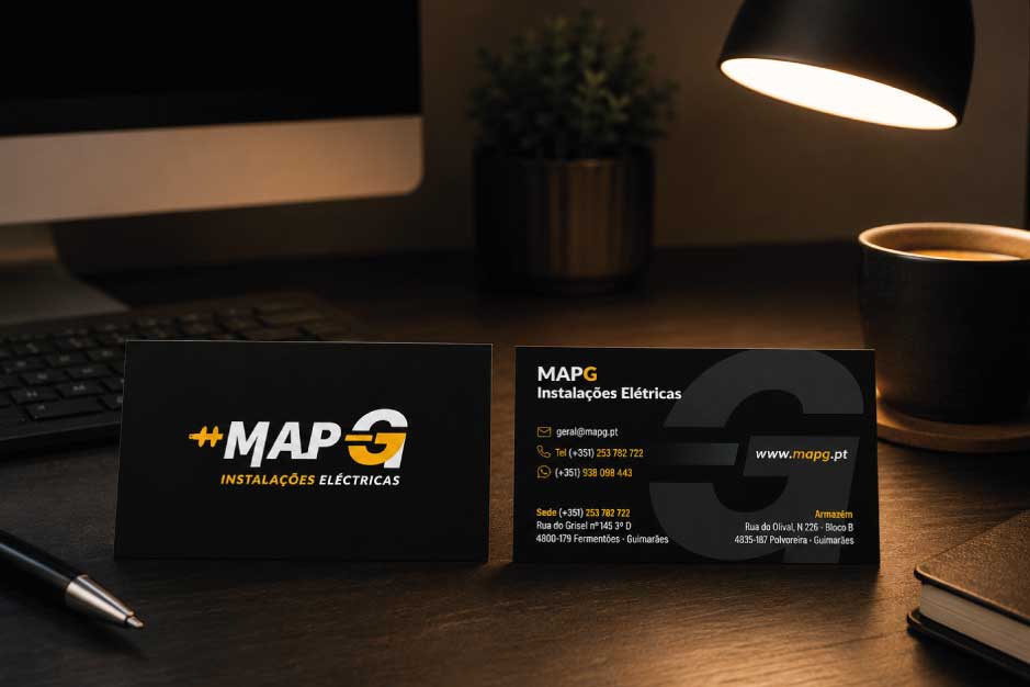
Business card design
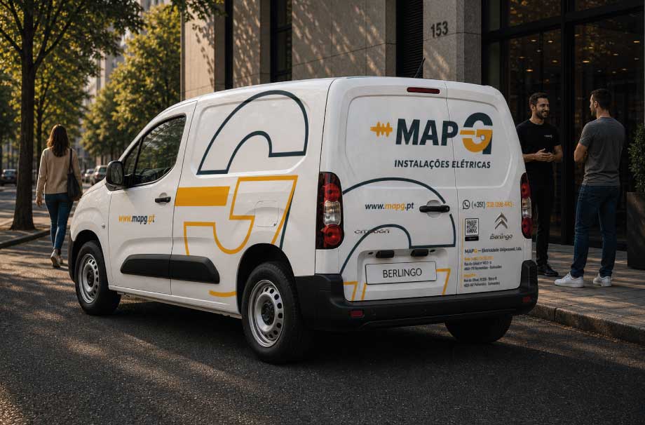
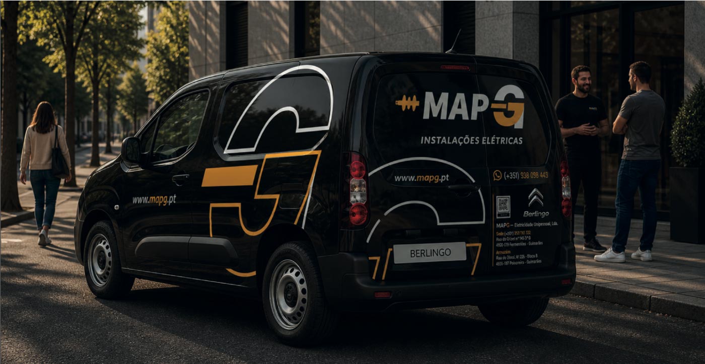
Vehicle branding application (white version)
Looking to build a stronger brand?
Every successful brand begins with a clear idea, a thoughtful strategy and careful attention to detail. If you're looking to create or evolve your visual identity, I'd be delighted to hear your story.
Let's Talk